Fiscal multiplier
This web page contains resources related to this academic article:
- Evans, A.J., “A bucket approach to teaching the fiscal multiplier” (Working Paper)
Links:
Student feedback form: here.
This web page contains resources related to this academic article:
Links:
Student feedback form: here.
1. Why don’t you take attendance at the start of class?
The first 15 minutes of the class are very important and I do not want to devote them to administrative tasks. I also want to pretend that you turn up to learn something, and not purely because you require proof of being present. You are expected to be present for the entire duration of the session and therefore it shouldn’t matter when I take attendance, but I normally do so at the start of the break. It is your responsibility to ensure that you are marked as present before leaving the class.
2. Why don’t you make all of the content from your lecture slides available?
As a professional educator one of my main concerns with the prevalence of digital content is the impact it has on a student’s ability to gather, synthesize, and critically engage with content. I try to ensure that all of my live sessions are unique and generate content that requires attention and consideration. For this reason I strongly encourage students to take notes, and debrief with group members, instead of relying on the provision of solutions, punchlines, or board plans at some future date. There are three types of powerpoint content that I reveal in class and aren’t visible in the PDF lecture handouts. They are either:
You should therefore treat this information the same as something I write on the whiteboard or say verbally, where the burden is on you to take notes rather than rely on handouts. Recognising what is pertinent and what is not is a key part of your obligations as a learner. This is also a reason why student attendance is important, since there is a necessity to be present in class to receive all of the necessary information. For the same reason that I don’t provide copies of my whiteboard plans or recordings of class, some powerpoint content is deliberately restricted.
Rest assured that I pay close attention to what is and isn’t within the PDF handout. If it is something relevant for an exam then it will be easy for you to fill in the gaps. If the information is relevant, but not necessarily important, you will be able to find out more either through a footnote or the additional resources on my website. In any case, if you feel that you didn’t capture some relevant information, whether it was communicated via powerpoint, on the whiteboard or verbally, just let me know and I’d be happy to help your revision. Part of my responsibility as an instructor is to ensure that you do not finish the course missing any important information. But your responsibility as a student is to be in charge of absorbing what happens in the classroom.
3. Why don’t you provide a word count or expected number of pages for assignments?
Because then I would also need to provide guidance on font size and other details that detract from your ability to establish, for yourself, an appropriate length and format.
4. What is an “open book” final exam?
You will take the exam on your own laptop and are allowed to consult any notes. The exam is “open book” in the sense that you can use course materials. However, you may not use your laptop (or any other electronic device) to communicate with anyone (e.g. another student or a LLM such as ChatGPT). The purpose of the exam is to test your knowledge of the content, rather than your ability to use the internet to find answers to questions. Therefore obtaining help from someone/anything else during an exam (whether it’s a fellow student or an AI) is a serious offense and will result in disciplinary action. You can use your device to access course materials. You may not use it for communication.
5. How do I get full marks on a MCQ?
For full marks you need to select all of the correct answers. Depending on the intended difficulty level and the software being used it may not be obvious how many of the provided answers are correct. This is to ensure that you consider each one carefully. Partial credit will be available in some instances.

This web page contains resources related to this academic article:
It is based on the following opinion piece by Milton Friedman:
The original sequence of interventions was as follows:
Part 1 – this simply gathers information about the participants for the original study.
Part 2 – this graded quiz should be used after reading the Friedman article. It can also be used a standalone activity for instructors who simply want to test student comprehension.
Part 3 – this should be used after reading the Friedman article and the handouts. This is more focused on applying the Concepts to the Cases than the original reading.
My policy on Generative AI (such as ChatGPT, Claude, or other other Large Language Models (LLM)) is a simple one:
Treat AI as a helpful person, such as a parent or friend.
***
What does this mean for class attendance?
❌ You are not allowed to ask it to attend class and take notes for you.
I can understand that having a parent or friend attend class with you to take notes might help your learning, but there are already policies in place for students that face difficulties with meeting basic expectations. Such requests should be made in advance and solutions found that take into consideration students that are capable of doing their own note taking. There is also a proprietary issue whereby class materials are not supposed to be made public or used for AI training purposes. In the same way that we don’t record live sessions, we don’t invite outsiders unless there’s a specific pedagogical reason.
What does this mean for studying?
✅ You are allowed to ask it questions for revision purposes.
❌ You are not allowed to upload course materials.
Course materials are proprietary content and unless explicitly stated should not be used outside of the classroom.
What does this mean for written assessments?
✅ You are allowed to ask it questions.
✅ You are allowed to get advice on writing.
❌ You are not allowed to submit any text that it generates as your own work.
❌ You are not allowed to submit any text into another piece of software that rewrites it.
The issue here is attribution and accountability. An attribution of authorship carries with it accountability for the work, which cannot be effectively applied to Generative AI. When you submit a piece of assessment the aim is to establish your unique understanding, as opposed to the understanding of someone else. This means that while you can use a wide variety of inputs to provide help, any output needs to be generated, and “owned” by yourself.
If you have found a way to automate your work, such that anyone (or anything) else can follow the steps that you take and create the same output, you have succeeded in finding efficiencies. You have possibly even generated important knowledge. But you have failed to complete the assignment you were set. Your formal assessment is intended to establish your ability, as a human, to complete the task. Formal assessment is not intended to establish your capability to use technology to meet an objective. That is why submitting other people’s work (whether it’s your parents, your friends, or from Generative AI) is fraud.
An inaccurate analogy would be to treat Generative AI like software, such as Microsoft Word. It is obviously not cheating to type answers in a word processor, or use spelling or formatting advice to improve your work. Unlike Word, however, Generative AI goes beyond helping your writing to actually help with content. Also, the fact that you can use an integrated spell checker is a function of an assignment being digital. If it is a handwritten essay then you may be permitted to use a dictionary, but you may not. A finance exam may permit a formula sheet, it may not. A maths exam may permit a calculator, it may not. There are all choices made by the instructor based on the learning objectives of the course. If standard software becomes integrated with AI this may blur the line, but as things stand it seems clear to me that using AI remains a choice and therefore its use should be related to the instructors objectives.
It is clear that assessment design needs to be updated due to AI. But not because anything has fundamentally changed – contract cheating has always been a problem. It’s just that the costs have become so much lower the practice has become much more widespread. And I see no difference in the need for an exam policy for AI than having one for Whatsapp. Both are communication tools. Both are outlawed.
| Examples of good assessment methods in an age of AI include: | |
| Restrict AI | Recognise AI |
|
|
Generative AI is more of an oracle than a piece of software, which is why I think it’s better to imagine it as a helpful person. Or, as Cowen and Tabarrok (2023) say in this very useful article about how to use ChatGPT,
“It resembles collaborating with a bright and knowledgeable research assistant, albeit one from a different culture.”
I also recommend developing some custom instructions. Here are Eli Dourado’s.
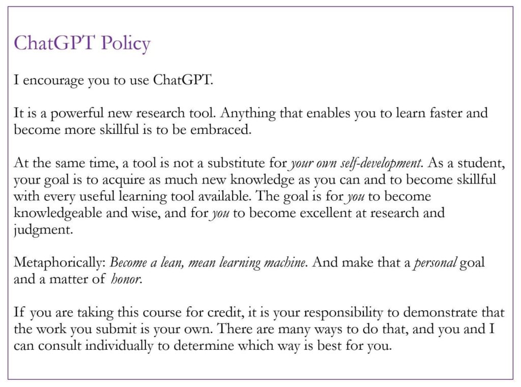
I recommend this article:
And I like this graphic:
What does this mean for management?
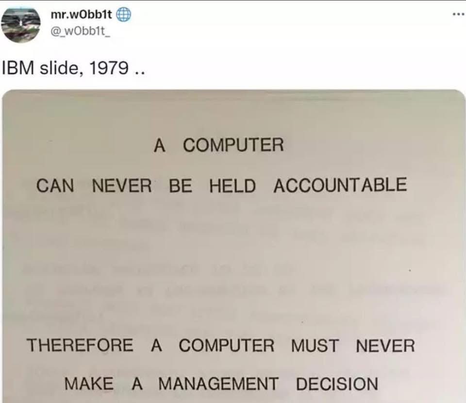
❌ AI should NOT be used for management decisions. Again, it comes down to accountability.
What does this mean for a thesis?
If you decide to use Generative AI in your thesis you should be honest and open about it, and provide an appropriate discussion in the Methods section (or, if a Methods section is not used, a suitable alternative part) of the manuscript. That will allow your advisor and committee to establish whether your use is appropriate. If you decide to use Generative AI but don’t explain how, this is fraud. In some cases, it may be that use of Generative AI is so heavy it warrants being a co author. This is fine if you list Generative AI as a co author, and you can do this for other types of work, but a thesis or other formal assessment must be single authorship.
Finally, ethical behaviour is important. Therefore:
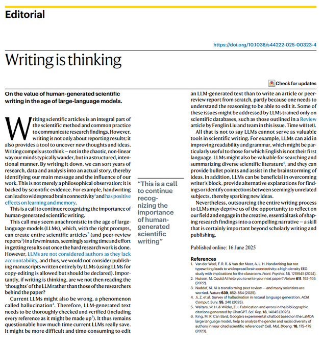
Writing is thinking. So don’t cheat yourself:
Don’t forget that the original excitement about AI was how quickly and easily it helped mediocre students imitate good students. If this is your situation then I can understand why it is an exciting tool. But I am more interested in your personal development than your ability to mimic others. Therefore I resist pressure towards conformity and advocate authentic work that is accountable. I prefer Human Authenticity over Artificial Intelligence.
Updated September2025
Business school students often produce exams or other written assignments in an essay style, but in most business situations a memo format is more appropriate. This article articulates what constitutes an effective memo so that we can try to replace bad academic writing with good business writing.
The aim of a memo is to quickly inform the reader and explain any decision making. It should be easy to read and have a clear message.
We tend to think of memos as an antiquated document but many emails are de facto memos. In fact, I would argue that any email sent to multiple people should be treated as a memo – they are an important part of a manager’s toolkit!
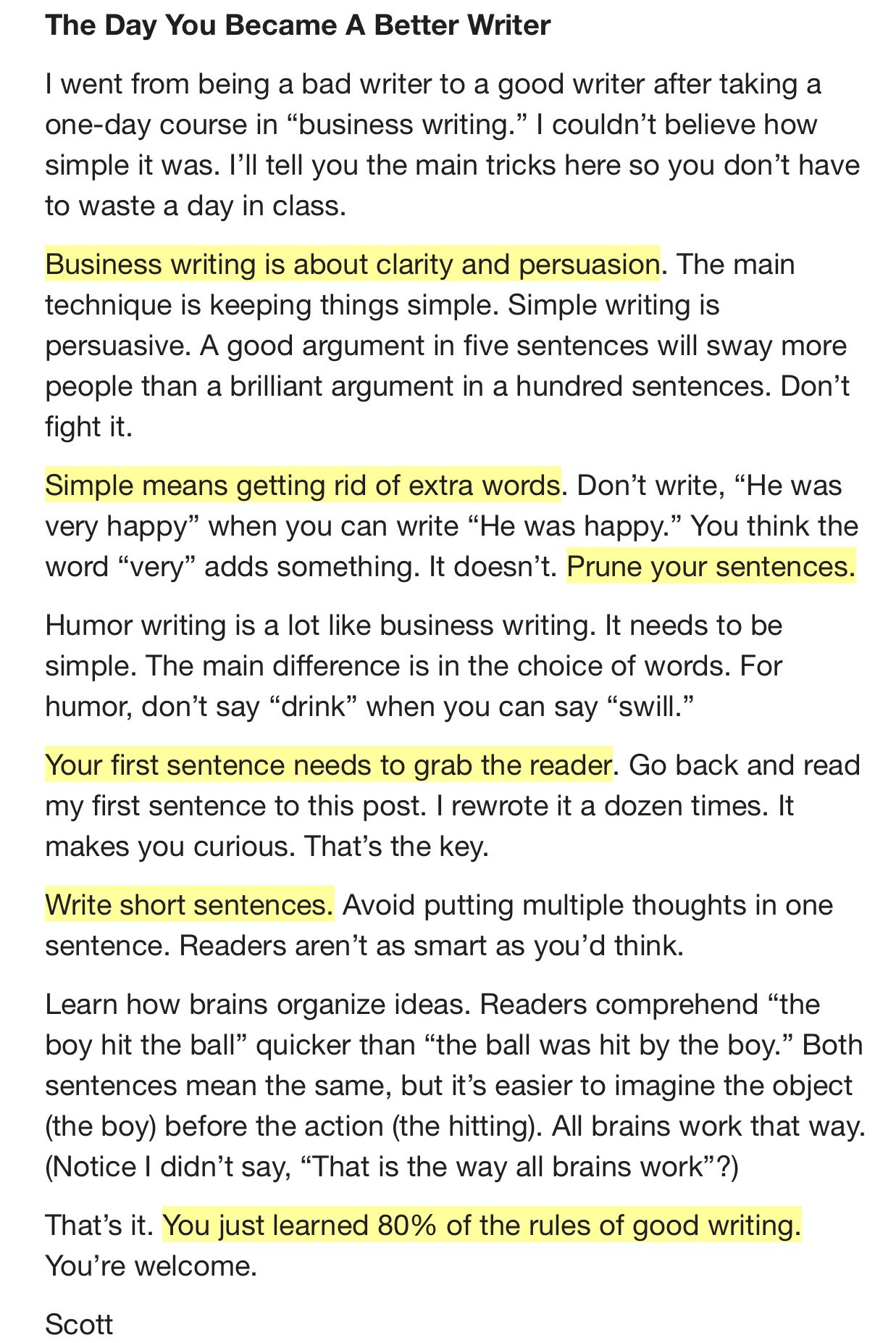
Addendum: Here the thoughts of Scott Adams on business writing (source):
And for a fascinating collection of corporate memos, see https://sriramk.com/memos.

In August 2009 I attended Harvard Business School’s “Global Colloquium on Participant-Centered Learning“. As a result I have incorporated several cases into my courses (email me if you want advice and/or recommendations) and written some of my own. I found the experience transformative, and despite having some challenges with implementing participant-centred learning, it’s now a big part of how I teach. For general comments on the case method see my posts at The Filter^, or the Case Analysis Coach. Further resources to find learn about the case method:
This is a great insight into what an effective case discussion looks like:
And this is a very useful look what is involved in making the case method effective:
Longer training programmes include:
But my advice to business school instructors is simple: apply to the GCPCL!
For online teaching I use:
Here’s a list of some websites/apps that I recommend for tests/quizzes/forms:
These are options that I used to use, but switched to Google Forms:
Qualtrics and Survey Monkey are great for running a survey, and purport to allow you to create a quiz, but in my experience lack the functionality required to be used in a classroom setting. I am very keen to find an intuitive quiz builder that allows students to see their score, and allows instructors to batch grade open ended questions and then export the results. So far it seems that Google Forms are the best option.
Here’s a list of some resources that have been recommended to me, but I don’t currently use:

Course outline: Doing Business in Eastern Europe 2019
Participants should read all of the following and submit a One Pager on one of them:
The lecture slides will be made available here.
Participants should select one of the countries under study and identify a potentially internationally competitive cluster. Using the format provided in the lecture, and the East Belarus mechanical engineering article as a guide, participants will submit a written report. The report should contain diamond analysis and cluster mapping.
The following clusters are not permitted:
Useful resources:

If an economics instructor requires students to submit work using PowerPoint, they can reasonably expect that those students will either possess the skillset required to do so, or recognise the need to develop it. And student’s wouldn’t feel that the choice of format is a source of disadvantage. In a few years time the same will apply to the creation of a video. We all need to become capable of producing videos with ease.
I see 4 options to create simple content:
Finally, it’s not always necessary to reinvent the wheel. I think there’s value added in giving students content that you’ve created, since it generates a student-teacher bond. But I also utilise high quality videos created by others.
Excellent sources for economics related videos are TED Talks, the St Louis Fed, Planet Money Shorts, and Learn Liberty.
I am an Affiliate Faculty Member of the Microeconomics of Competitiveness program at Harvard Business School, and a big fan of Michael Porter – his work consistently reminds me of the importance of bringing clarity to management practice.
I also like his inclination for frameworks rather than models. If your goal is to interpret and assess, as opposed to measure and predict, a framework is a critical analytical tool. One that I especially like is his explanation for what determines competitiveness. For example, consider the following slide (which I believe originates from here).
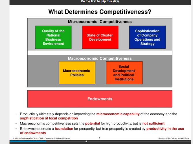
I’ve given this framework a lot of thought, but I don’t think it fits as neatly into the Diamond model as is often claimed. For example in this NBER paper Porter (and co-authors) present an enlarged version:
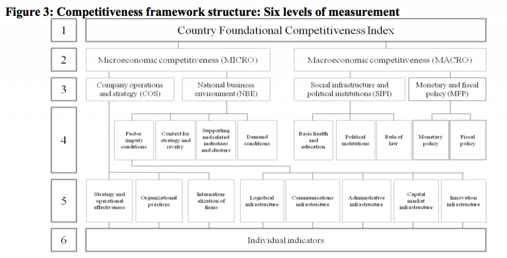
This clearly shows that the Diamond model is intended to be a more detailed view of the “Quality of the National Business Environment” segment. But consider something like nutrient rich soil, or a large natural harbour. One might think that constitutes an endowment. But it is also a relevant “Factor input condition”. Indeed what’s the difference between the “Supporting and Related industries” and “State of Cluster Development”? I suspect this is why Figure 3 above has dropped endowments and clusters, and renamed it a “Foundational Competitiveness Index”. I think this is a shame, because the “What Determines Competitiveness” slide is clearer, and more coherent, than the FCI.
I think Porter’s attempt to force fit the Diamond model into the Competitiveness index creates an opportunity to take the “What Determines Competitiveness” slide in a new direction. Indeed I think it complements nicely the “Growth is Like an iPhone” analogy:
In my attempts to merge the three level analogy with a template that my students can use in class, and with all appropriate nods to Prof. Porter, this is the “Country Competitiveness Dashboard“:
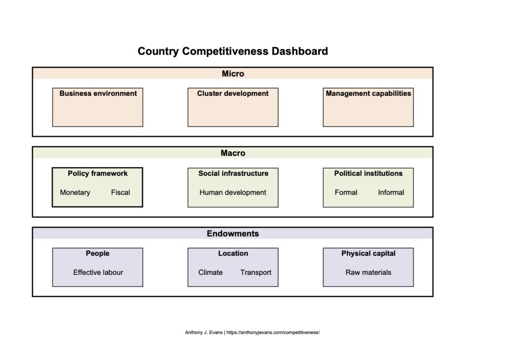
Rather than viewing the Diamond model as a subset of the “Business environment”, I see it more as a strategic tool that cuts across the whole Country Competitiveness Dashboard. In other words step 1 is to populate the dashboard, and ensure that you are covering all bases. Step 2 is to conduct a Diamond analysis – which is better suited at the cluster level than the national level anyway.
The endowments above are rooted in economic growth theory, but I am always struck at how important they seem to be when reading geopolitical accounts. The list below shows some of the typical go to areas when trying to understand the starting position of a country.

I think it’s important to understand competitiveness but it looks toward the supply side of the economy, which is much more important for long term growth than either monetary or fiscal policy. Two recent articles on the rise of new supply side thinking include:
Here is my application of some of these concepts to Belarus:
Finally, it is well worth reading Paul Krugman’s, Competitiveness – a dangerous obsession (Foreign Affairs, March/April 1994). When treated as a mercantilist trade “strategy”, or the conflation of corporate planning with national level decision making, attention to competitiveness can lead us down the wrong path. But when competitiveness is wedded to our understanding of economic growth, and the conditions required for entrepreneurship to flourish, the competitiveness framework is immensely beneficial.

Having attended the MOC programme in 2013 and 2015, I then utilised some of the concepts on a special programme for a small private business school in Sofia, in 2016 and 2018. Little did I know that two other graduates from the MOC programme were running the full course through the University of Sofia during this period. And in 2021 Kiril Perkov and Assen Vassilev became Prime Minister and Finance Minister respectively. This is a great example of the clear links between classroom knowledge and policy leadership.