Collecting and Presenting Data
This article intends to walk through a process for collecting and presenting data. It will include some basic commands in Excel and Powerpoint. The slide deck below provides a step-by-step guide. You should follow it in order to complete the set tasks.
You will need the following to get started:
- Download “aje_template.potx“
- You can download handouts for these slides here: “aje_data.pdf“
Tasks
1. Replicate the following PDF file (but without the patterned fill): “aje_data_chart.pdf”
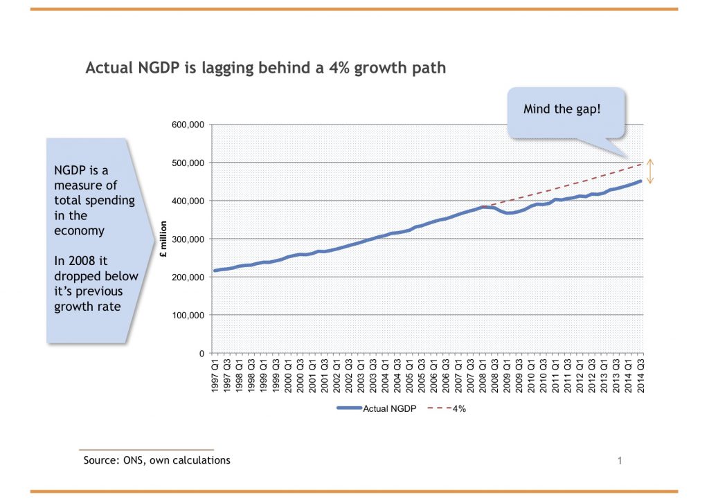
- Kaleidic Guide to Using the UK National Accounts
- Find the NGDP figures from the ONS website (here’s a stable link for our data)
- Email me for the solution: “aje_data_1.xlsx”
2. Replicate the following PNG image (but without the patterned fill):
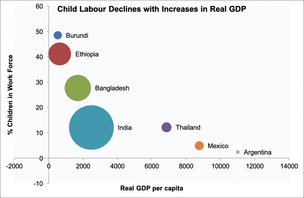
- Download “aje_data_2.xlsx“
- Email me for the solution: “aje_data_3.xlsx”
Resources on data visualisation:
- Not all graphs are straight lines by me
- Schwabish, J., 2014, “An Economist’s Guide to Visualizing Data” Journal of Economic Perspectives 28(1):209-234
- Why you sometimes need to break the rules in data viz by Rosamund Pearce
- Fundamentals of Data Visualization by Claus Wilke
- BBC Visual and Data Journalism cookbook for R graphics
- Data visualisation white paper by SAS – this is very thorough
- Graphics Principles Cheat Sheet
- ChartPorn.org
- Modern approaches to data visualisation
- Chart format guide (by Paul Bolton), House of Commons Library Standard Note, October 15th 2014
- How to improve your tables – less is more
- Mistakes, we’ve made a few
Some examples of good data visualisation:
- The fallen of WW2
- Think before you use a donut chart
- 2016 Internet Trends, by Mary Meeker, KPCB
- This tweet by Brian Reyes
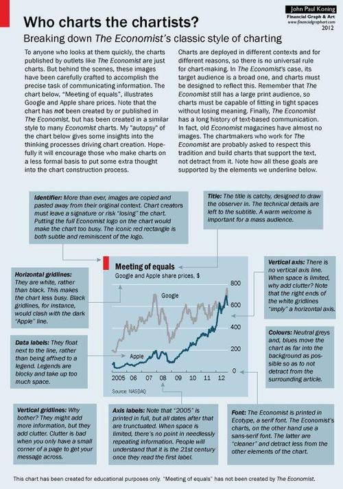
The Economist is renowned for good data visualisations. Here is their advert for data journalists, demonstrating their expertise.
This is part of my online course on Analytics.
10 Replies to “Collecting and Presenting Data”
Comments are closed.
Dear Antony,
I would like to attend in the additional QM class on Feb10th.
Thank you in advance for your time
Regards
In
Pip in!
In
im in as well
In
Celia in. Thanks for the extra class Anthony.
I’m in too
In
Dear all – this is to confirm that the class will go ahead tomorrow. I look forward to seeing you all at 11am!